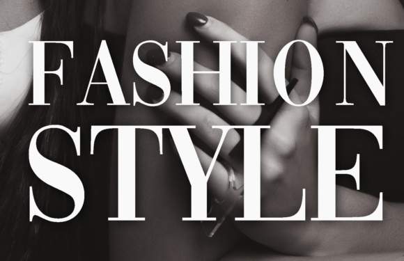
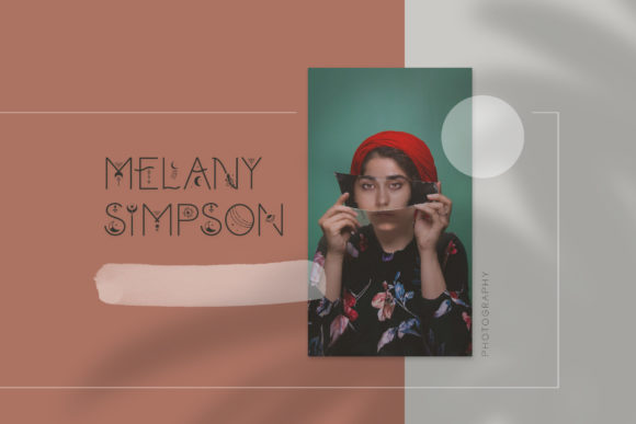
Here is a brutal truth about the Amazon KDP marketplace: buyers will absolutely judge your book by its cover in less than 1.5 seconds. You could spend days research-targeting the best kdp planner templates and building an flawless interior layout, but if your cover font looks cheap, amateurish, or completely unreadable in a tiny Amazon search thumbnail, nobody is ever going to click on it. Your interior will simply sit gathering digital dust.
When it comes to low and medium-content publishing, your cover typography does 90% of the heavy lifting. It needs to instantly communicate the vibe of the book—whether it’s a cozy wellness journal or a structured financial logbook—while remaining razor-sharp on mobile screens.
To help you out-design the competition and stop losing sales to generic system typefaces, I’ve curated the ultimate list of premium typography assets. Let’s dive into the best KDP cover fonts on Creative Fabrica that will make your books look like high-end boutique stationery and drive actual clicks.
💡 Fastest way to get all 17 templates: All of the planners below are available through Creative Fabrica’s All Access subscription — one plan, unlimited downloads, full commercial license. Start your free trial →
📁 Quick Navigation: Find Your Best KDP Cover Fonts
🧸 Part 1: Bold & Playful Best KDP Cover Fonts
Best for kids’ coloring books, school planners, and high-energy niches.
- 1. Sandy Kids Display Font
- 2. Bubble Joy Layered Font
- 3. Chewy Bubble Typography
- 4. Mike Boom Font
- 5. Barbie Vintage Font
✨ Part 2: Elegant, Serif & Minimalist Fonts
Best for wellness journals, habit trackers, and “Quiet Luxury” designs.
🌙 Part 3: Mystic & Boho Best KDP Cover Fonts
Best for trendy manifestation diaries, astrology layouts, and tarot logs.
📊 Part 4: Clean Sans-Serif & Modern Fonts
Best for professional business planners, logbooks, and financial trackers.
🛠️ The KDP Cover Typography Checklist
💬 Frequently Asked Questions (FAQ)
Similar Reads:
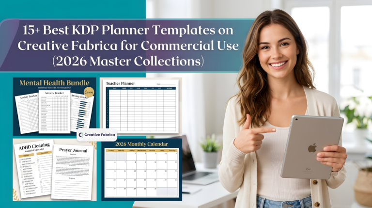
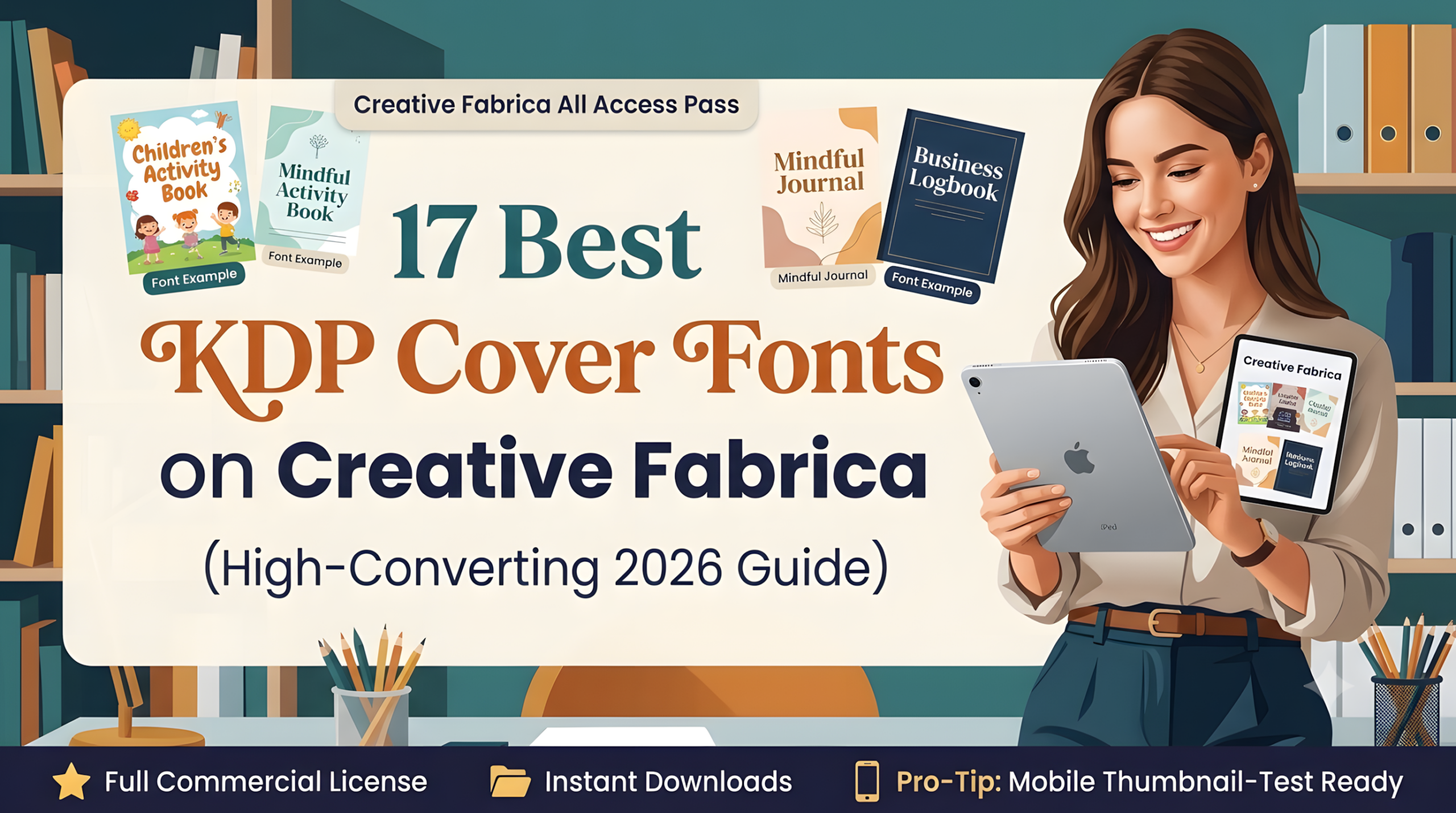
- 17 Best KDP Cover Fonts on Creative Fabrica (High-Converting 2026 Guide)
- 15+ Best KDP Planner Templates on Creative Fabrica for Commercial Use (2026 Master Collections)
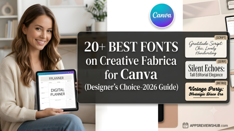
- 20+ Best Fonts on Creative Fabrica for Canva (Designer’s Choice-2026 Guide)
- 19 Best Canva Templates on Creative Fabrica to Download in 2026
⚡ Designer’s Pro-Tip: Don’t Buy These Individually!
If you plan on downloading more than just one or two fonts, purchasing them individually is a massive waste of money.
With a Creative Fabrica All Access Subscription, you get unlimited commercial downloads of all 7,000+ templates, master collections, and premium best KDP cover fonts listed below for a fraction of the cost.
Part 1: Bold, Cute & Playful Fonts
If you are publishing in child-centered or high-energy niches—think activity books, preschool handwriting logs, primary school academic planners, or kawaii-styled journals—skinny or ultra-elegant fonts are your worst enemy. You need typefaces with massive weight, soft edges, and an undeniable sense of fun.
These fonts need to be “bubbly” enough to pop off a brightly colored background and be easily readable by parents scrolling on their phones.
Here are the standout playful options on Creative Fabrica right now:
1. Sandy Kids Display Font
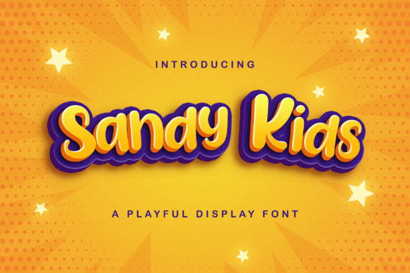
- Rating: ⭐ 5.0/5
- Format: OTF, TTF (Canva & Illustrator friendly)
- Best For: Kindergarten activity books, elementary school planners, and cute kids’ journals.
Sandy Kids is an incredibly joyful, adorable display font that brings an instant handmade warmth to any layout. It has that authentic, neat childhood lettering style that completely avoids looking rigid or digital.
If you are designing primary school trackers or primary academic diaries, this typeface makes the cover look welcoming, friendly, and highly trusted by parents and teachers alike.
2. Bubble Joy Layered Font
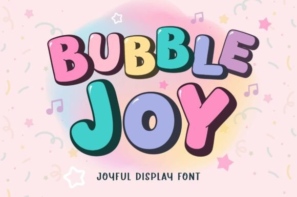

- Rating: ⭐ 4.9/5
- Format: OTF, TTF (Regular and Outline styles included)
- Best For: High-energy activity covers, layered title typography, and fun sticker-book covers.
Bubble Joy is a massive asset for KDP publishers because it comes in both Regular and Outline styles. These two layers stack perfectly, allowing you to create trendy, eye-catching title shadows and sticker-style graphics in seconds without manual tracing.
It stays remarkably sharp and legible even when scaled down to a tiny mobile Amazon thumbnail, making it a perfect tool for standout coloring books and birthday-themed low-content assets.
3. Chewy Bubble Typography
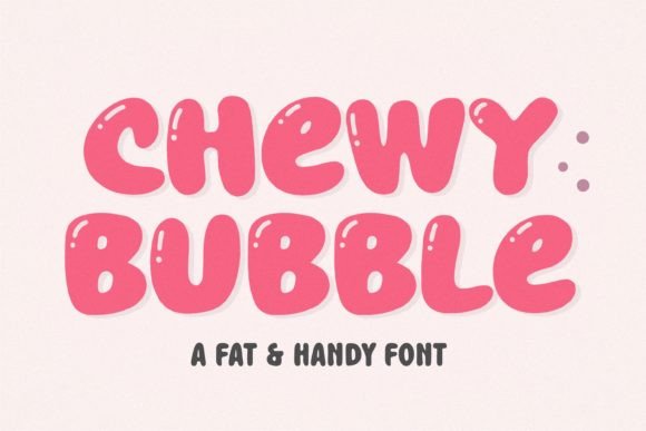
- Rating: ⭐ 5.0/5
- Format: OTF, TTF, WOFF
- Best For: Toddler logbooks, fat-lettering coloring book titles, and whimsical nursery notebooks.
True to its name, Chewy Bubble features bold, ultra-rounded forms that look exactly like smooth, playful bubbles floating on your cover. The generous spacing and carefully crafted fat curves give it an undeniable sense of fun and whimsy.
It is specifically designed to grab a buyer’s attention during a quick scroll, making it a stellar choice when your cover art relies completely on a striking text-focused layout.
4. Mike Boom Font
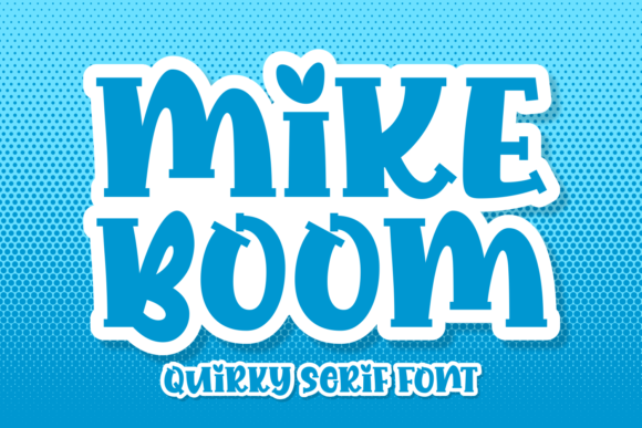
- Rating: ⭐ 4.8/5
- Format: OTF, TTF (Premium Freebie Collection)
- Best For: Gamified chore charts, cartoon-style sketchbooks, and action-oriented school planners.
Mike Boom brings a quirky, punchy, comic-book aesthetic to the table. It is full of personality, authenticity, and motion, making it a brilliant choice for slightly older kids’ activity books or school projects.
If you need a font that breaks away from generic, cute templates and adds a burst of energetic, playful character to an Amazon listing, this display font delivers exactly that.
Like these picks? They’re all included with Creative Fabrica All Access — rated 4.8 from 590+ reviews.
5. Barbie Vintage Font
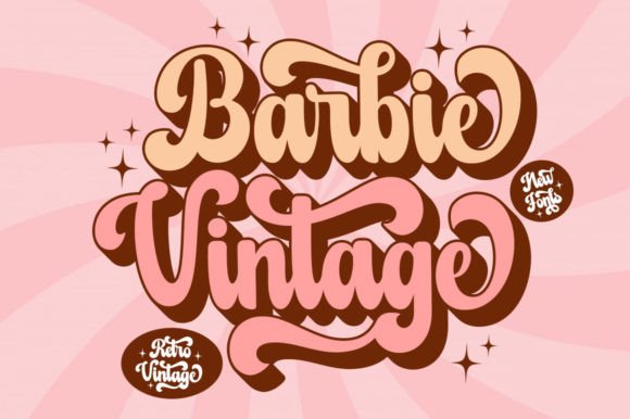
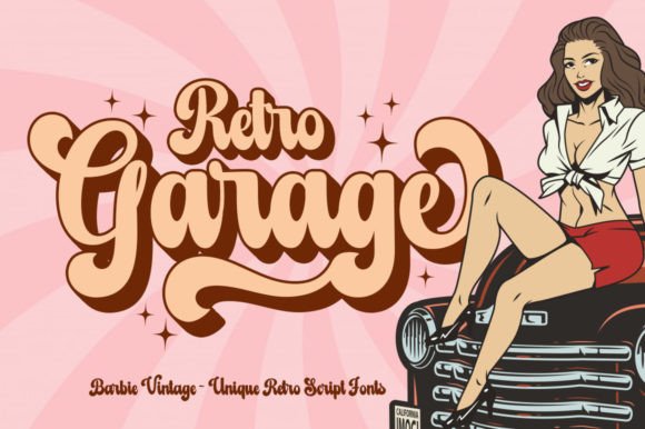
- Rating: ⭐ 4.7/5 (Based on 25 reviews)
- Format: OTF, TTF (Separate Extrude/Shadow layer available)
- Best For: Playful retro journals, teen sticker-book covers, kawaii academic diaries, and nostalgic activity logs.
Barbie Vintage is a playfully nostalgic display font that brings a massive burst of fun and retro charm to your cover typography. What makes this a standout asset for modern KDP publishers is its distinct 3D styling potential—while the main file includes the crisp, bold base lettering, you can grab the separate “shadow extrude” file to stack them perfectly.
This allows you to generate high-converting, sticker-style pop effects that make your book titles instantly jump off the screen in competitive Amazon search thumbnails.
Part 2: Elegant, Serif & Minimalist Fonts
When designing covers for the wellness, beauty, self-care, and lifestyle niches, your typography needs to feel like an experience. Buyers scrolling through Amazon for a self-reflection journal, a skincare planner, or a morning gratitude diary are looking for peace, mindfulness, and a touch of luxury. For these books, standard system fonts look cold and mass-produced. You need elegant serifs, editorial-style layouts, and graceful ligatures that make the book look like an aesthetic accessory on a bedside table.
Here are the top-performing elegant serif options if you are looking for the best KDP cover fonts on Creative Fabrica for your lifestyle covers:
6. Olive & Citrus Font
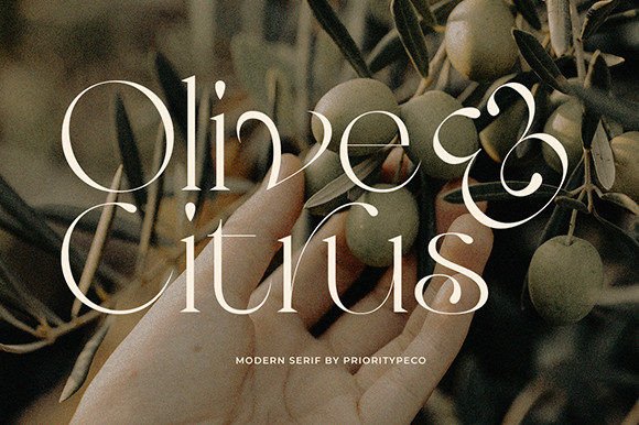
- Rating: ⭐ 5.0/5 (Based on 13 reviews, 2,241 favorites)
- Format: OTF, TTF (PUA encoded glyphs & ligatures included)
- Best For: Minimalist beauty journals, skincare planners, wellness diaries, and feminine lifestyle covers.
Olive & Citrus is a modern, classic masterpiece that brings a clean, high-end editorial feel to your cover art. The secret weapon here is its PUA-encoded glyphs and ligatures, which allow you to customize how letters connect in your book titles without needing to draw them from scratch.
It is incredibly balanced, making it a stellar choice for minimalist layouts where you want the typography to stand completely on its own against a soft, pastel or neutral-toned background.
7. Vogue Font
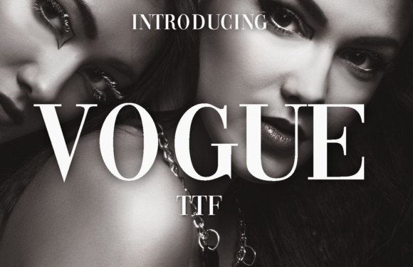
- Rating: ⭐ 4.8/5 (Based on 16 reviews, 2,783 favorites)
- Format: OTF, TTF (High-fashion display font)
- Best For: Luxury beauty diaries, fashion-inspired wellness planners, glow-up trackers, and makeup notebooks.
If you want your low-content book to immediately scream “high fashion,” Vogue is one of the best KDP cover fonts to use as your go-to asset. Inspired by iconic luxury magazine mastheads, this font uses sharp contrasts between thick and thin lines to create an upscale, glamorous mood.
A quick designer’s warning: avoid copying famous magazine cover layouts too closely to protect your account, but absolutely use this typeface as a bold center-aligned statement title on rich, minimalist dark or cream-colored paper textures.
8. Hostania Font
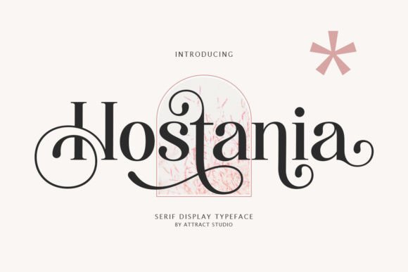
- Rating: ⭐ 5.0/5 (Based on 6 reviews, 1,204 favorites)
- Format: OTF, TTF, WOFF (Clean, scalable vector serif)
- Best For: Cosmetic planners, feminine gratitude journals, aesthetic self-care workbooks, and minimalist notebooks.
Hostania is a beautiful, nostalgic serif that strikes an incredible balance between classic typography and modern minimalism. What makes it a standout asset for KDP is its scalability—it retains flawless clarity and elegance whether you use it as a massive headline text or compressed into smaller subtitle fonts.
It has a natural “cosmetic brand” aesthetic, making it incredibly easy to pair with delicate line art illustrations or clean botanical graphics.
9. Sparky Dream Font
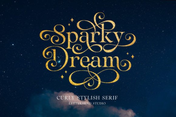
- Rating: ⭐ 4.3/5 (Based on 27 reviews, 6,992 favorites)
- Format: OTF, TTF (Decorative swashes and curly ligatures included)
- Best For: Statement title typography for manifestation notebooks, quote journals, and elegant gratitude diaries.
With nearly 7,000 favorites on Creative Fabrica, Sparky Dream is an absolute fan-favorite for a reason. This timeless serif features incredibly graceful, curly swashes that add immediate charm, sophistication, and a sense of magic to your cover.
Because it is highly decorative and rich in character, it works best as a standalone statement font for short, impactful titles (like “Gratitude” or “I Am”). To keep the design balanced and highly legible in search thumbnails, always pair it with a very simple, clean sans-serif font for your subtitles.
Get your first 10 templates free. Creative Fabrica offers a risk-free trial that includes 10 free downloads — enough to grab 2-3 of the bundles from this list (like the 100+ Editable Templates pack) without paying anything upfront. Cancel anytime if it’s not for you. Activate free trial →
Part 3: Witchy, Mystic & Boho Display Fonts
The mystic, esoteric, and boho-chic niches on Amazon KDP are experiencing a massive boom. Modern buyers are deeply obsessed with tracking their habits through moon phases, documenting their shadow work, and mapping out their goals using astrology and tarot logs.
For these sub-niches, regular corporate typefaces will completely ruin the layout. You need display fonts that evoke a sense of ancient magic, celestial wonder, or vintage 70s bohemian charm.
Here is a breakdown of the best KDP cover fonts for mystic layouts available on Creative Fabrica to make your projects look truly magical:
10. Wicked Halloween Font
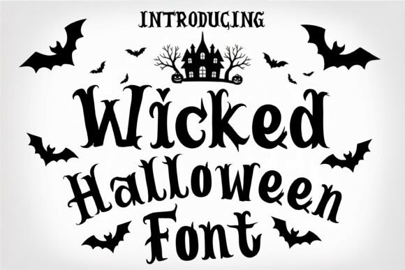
- Rating: ⭐ 5.0/5 (Based on over 15,626 favorites)
- Format: OTF, TTF (Bold display vector cuts)
- Best For: Witchy spell journals, shadow work notebooks, Halloween planners, and dark occult cover designs.
Boasting over 15,000 favorites, Wicked Halloween is the ultimate powerhouse in the spooky and occult font category. This isn’t just a casual seasonal typeface; its bold, slightly eerie, and irregular letterforms create immediate visual drama.
For KDP publishers, this is a premium title choice for heavy-hitting shadow work journals. To make it pop off the screen in Amazon mobile search results, slap this font onto a dark, high-contrast background (think deep velvet black or midnight purple) with a metallic gold or stark white color overlay.
11. Celestial Font Family
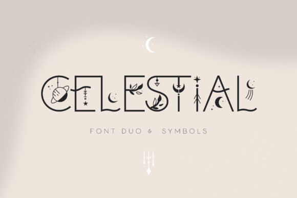
- Rating: ⭐ 5.0/5 (Multiple 5-star community reviews)
- Format: OTF, TTF (Includes Decorative, Sans Serif, and Dingbats variations)
- Best For: Moon phase journals, astrology planners, tarot notebooks, and boho mystic cover designs.
Celestial is a brilliant, all-in-one kit that gives you massive creative freedom. Inspired directly by bohemian mystery and stellar alignments, this font family includes clean faces alongside decorative variations. The absolute game-changer here is the included Dingbats variation.
As a designer, this means you don’t need to waste time drawing custom star clusters or moon icons—you can type celestial symbols directly into your title layout to frame your text beautifully, creating a premium product look in minutes.
12. Wizard School Font
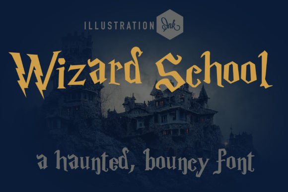
- Rating: ⭐ 5.0/5 (Based on 1,076 favorites)
- Format: OTF, TTF (Hand-crafted fantasy style)
- Best For: Witchcraft grimoire covers, spell book journals, fantasy trackers, and dark academia notebooks.
If you are targeting the heavily trending “Dark Academia” aesthetic or creating magical notebook templates for fiction lovers, Wizard School is your go-to asset. Its distinct hand-crafted curves and sharp angles evoke immediate visual storytelling, making the buyer feel like they are holding an actual textbook from a castle library.
Because it has such a strong, eccentric personality, let it take center stage as a massive title font, and use a crisp, ultra-simple sans-serif for your lower subtitle or author name to avoid visual clutter.
13. Boho Astro Font
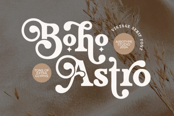
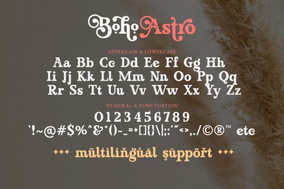
- Rating: ⭐ 4.9/5 (High download volume in the boho/zodiac niche)
- Format: OTF, TTF (Includes alternative glyphs accessible via Font Book / Character Map)
- Best For: Boho astrology journals, zodiac planners, vintage celestial diaries, and tarot card cover art.
Boho Astro is a gorgeous, heavy modern serif that effortlessly bridges the gap between retro 70s vintage layouts and contemporary mystical design. It comes packed with alternate decorative glyphs, allowing you to tweak individual letters to fit your cover layout perfectly.
If you are planning a series of 12 distinct zodiac planners, this font is perfect—the bold serif weights look incredibly professional when printed on physical matte-finish Amazon hardcovers, giving your brand an instantly high-end, boutique stationery feel.
Part 4: Clean Sans-Serif & Modern Fonts
When you move away from creative sub-niches and enter the high-stakes world of corporate productivity, small business logistics, accounting logs, and financial trackers, your typography strategy must pivot completely. Corporate and finance buyers on Amazon KDP are looking for authority, absolute clarity, and flawless structure.
Any font that looks too decorative or whimsical will immediately look unprofessional. For these book covers, your best assets are geometric and humanist sans-serifs that maintain razor-sharp legibility at any thumbnail scale.
Here are the top professional, modern sans-serif fonts on Creative Fabrica built to command trust on Amazon:
14. Vancouver Font

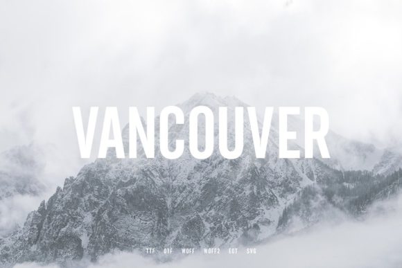
- Rating: ⭐ 5.0/5 (Featured in Creative Fabrica’s Official Sans-Serif Editorial Guide)
- Format: OTF, TTF (Bold display sans-serif)
- Best For: Business planning notebooks, financial tracker covers, productivity journals, and corporate workbooks.
Vancouver is a beautifully simple, heavy-weight sans-serif that instantly communicates strength and institutional trust. Because its letterforms are bold and solid, it acts as a perfect visual anchor for a book cover title. In the world of business and finance journals, buyers want a product that feels serious and structured.
Vancouver delivers exactly that mood, making it one of the best KDP cover fonts for bold headlines. For a balanced layout, always pair it with an ultra-thin, clean sans-serif for your subtitles.
Like these picks? They’re all included with Creative Fabrica All Access — rated 4.8 from 590+ reviews.
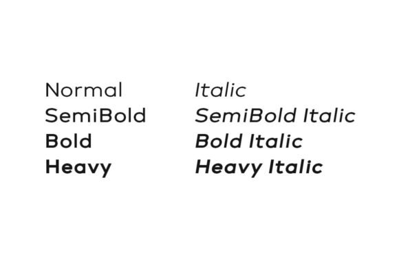
15. Poppins Typeface
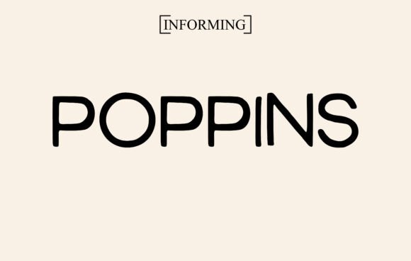
- Rating: ⭐ 5.0/5 (Industry Standard Geometric Sans-Serif)
- Format: OTF, TTF (Includes a wide range of weights from Light to Black)
- Best For: Business logbooks, expense trackers, startup planners, and minimalist high-end productivity journals.
Poppins is a gorgeous, geometric sans-serif typeface that has taken the design world by storm due to its perfect circular forms and monolinear stroke joints. What makes Poppins an incredible asset for KDP cover production at scale is its massive versatility—you get a huge variety of weights within a single family.
This allows you to create complete typographic hierarchy using just one font family (e.g., using Poppins Bold for the main title and Poppins Light for the subtitle), giving your cover an instantly clean, high-end corporate look.
16. Brooklyn Font
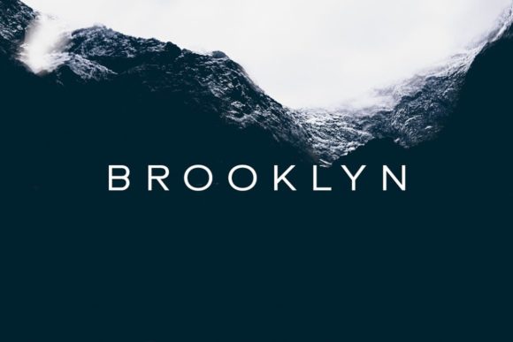
- Rating: ⭐ 4.9/5 (Highly rated across Creative Fabrica craft and design communities)
- Format: OTF, TTF (Minimalist crisp layout face)
- Best For: Minimalist side hustle trackers, clean finance logs, lean productivity planners, and modern self-improvement workbooks.
Brooklyn is a brilliantly neutral, minimal, and crisp sans-serif font designed for absolute clarity. Its clean, unpretentious curves make it a true chameleon in your font library—it easily matches almost any layout style or background color palette you throw at it.
It is particularly effective for creating headers that mimic the high-end look of boutique fashion web stores and premium portfolio websites, helping your KDP books look like luxury lifestyle planners rather than cheap notebooks.
17. Sweet Home Font

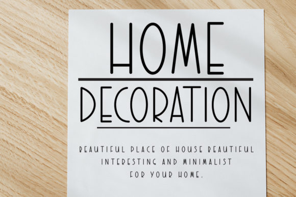
- Rating: ⭐ 5.0/5 (Premium Minimal Collection)
- Format: OTF, TTF (Clean monolinear geometric faces)
- Best For: Minimalist expense logs, real estate trackers, home organization planners, and clean productivity notebooks.
Sweet Home is an elegantly structured, minimal sans-serif font that brings a sleek, contemporary touch to your cover designs. Featuring beautifully elongated vertical lines and crisp, neat curves, it effortlessly captures that high-end architectural and Scandinavian minimalist aesthetic.
For KDP publishers targeting home budget trackers, real estate logbooks, or lean lifestyle planners, this font acts as an instant upgrade—its high contrast and modern posture make your titles stand out with absolute clarity inside competitive Amazon search results.
🛠️ The KDP Cover Typography Checklist: How to Avoid Account-Killing Design Mistakes
Choosing a stunning font on Creative Fabrica is only half the battle. If you don’t apply it correctly within your cover layout, Amazon’s automated formatting bots or unhappy buyers will tank your book launch before it even starts.
Before you hit “Publish” in your KDP dashboard, run your cover layout and your chosen best KDP cover fonts through this professional design checklist:
1. The Mobile Thumbnail Test (The 10% Rule)
- What it is: More than 70% of Amazon buyers shop on their smartphones. This means your book cover will first be seen as a tiny digital stamp.
- How to fix it: Zoom out your design canvas to 10% size in Canva or Illustrator. Can you still effortlessly read the main title in less than a second? If your decorative elements (like swashes or thin serifs) blur together into a messy blob, increase the font size, bump up the weight, or switch to a bolder face like Vancouver or Chewy Bubble.
2. Contrast is King (Drop the Overlapping Chaos)
- What it is: Putting dark text over a dark cover graphic, or light text onto a busy watercolor pattern, completely destroys readability.
- How to fix it: Always use high-contrast color pairings. If your artwork is detailed or busy, use flat background shapes, subtle rectangles, or opacity masks beneath your typography to isolate the text. For playful fonts like Barbie Vintage or Bubble Joy, leverage separate shadow layers or clean white strokes to pop your text off the page.
3. Stick to the 2-Font Limit
- What it is: Amateur covers often look chaotic because the publisher used three, four, or five different font styles on a single layout.
- How to fix it: Limit your cover to a maximum of two font families. Use one highly distinctive Display Font for your primary hook title (e.g., Wicked Halloween or Sparky Dream), and pair it with a highly stable, neutral Sans-Serif family (like Poppins) for subtitles, author names, or series details.
4. Mind the Amazon KDP Safety Margins & Bleed
- What it is: Amazon’s physical printing presses shift papers slightly during production. If your title text sits too close to the outer edges or the center spine, it will get chopped off, leading to a rejected print file or 1-star buyer reviews.
- How to fix it: Keep all your core typography inside the safe zone (at least 0.375 inches away from the outer edges of your cover template). Never let your title cross onto the spine boundary unless you are designing a thick hardcover book over 100 pages.
5. Check the Commercial License Details
- What it is: Using free system fonts or downloaded “personal use only” files can result in trademark strikes or account termination if copyright holders flag your commercial book listings.
- How to fix it: This is exactly why sourcing your typography through a Creative Fabrica All Access Pass is a literal lifesaver. Every single font family mentioned in this guide comes bundled with a full, verified Commercial Use License, meaning you can print and sell an unlimited number of physical books on Amazon without a single legal worry.
💬 Frequently Asked Questions (FAQ)
Do fonts downloaded from Creative Fabrica include a commercial license for Amazon KDP?
Yes, absolutely. One of the biggest reasons independent publishers love Creative Fabrica is its straightforward licensing model. When you download a font under an active subscription or buy it individually, it comes with a full Commercial Use License. This explicitly allows you to use the font on physical products, including low-and-medium-content book covers and interiors sold on Amazon KDP, for unlimited print runs.
Can I upload Creative Fabrica fonts directly into Canva Free?
To upload custom font files (such as .otf or .ttf formats) into Canva, you will need a Canva Pro subscription. Once upgraded, you can effortlessly drag and drop your downloaded Creative Fabrica fonts into your Canva Brand Kit and use them across all your book covers.
If you are using Canva Free, you will have to look for alternatives. Check out our curated list of the best fonts on Creative Fabrica for Canva to find options that work perfectly within your favorite design app without manual uploads.
What is the difference between OTF and TTF font formats, and which should I use for KDP?
Both formats work perfectly fine, but as a professional designer, I highly recommend installing the OTF (OpenType Font) format whenever it’s available. OTF files are newer and carry more advanced typographic data. This means they include those gorgeous custom ligatures, special character variations, and alternate glyphs (found in fonts like Olive & Citrus or Boho Astro) that give your cover that custom, premium agency look.
Will my account get flagged by Amazon if I use popular fonts like Poppins?
Not at all. Standard geometric and humanist fonts like Poppins are fully open-source or commercially cleared, making them 100% safe to use on any public marketplace. Amazon only flags accounts for trademark or copyright infringement if you try to exactly copy famous brand logos, use restricted pop-culture phrases, or source protected “personal use only” files illegally from unverified web repositories.
Is a Creative Fabrica All Access Pass worth it for a beginner KDP publisher?
If you plan on launching more than three books, it pays for itself instantly. Buying premium fonts or editable cover templates individually at $5 to $9 a piece adds up to a massive upfront cost. With an All Access Pass, you get immediate, unlimited commercial downloads of every single typeface on this list, plus thousands of ready-to-upload KDP interior layouts and graphics. It completely removes the financial barrier to scaling up your publishing business.
🏁 Final Thoughts: Your Cover is Your Digital Storefront
At the end of the day, Amazon KDP publishing is a game of high-visibility impressions. You can build the most meticulously structured tracking logs or bullet journals, but if your cover typography fails to catch a buyer’s eye during their morning scroll, your efforts will never translate into sales.
Don’t settle for the tired, generic system fonts that make your projects look like lazy, automated templates. Upgrade your toolkit with a couple of premium, high-converting display faces, run your final layout through our Typography Checklist, and watch your click-through rates climb.
Happy designing, and see you at the top of the Amazon Bestseller ranks!
Disclaimer: AppsReviewsHUB.com participates in affiliate programs and may earn a commission on purchases made through our links, at no extra cost to you.